Showing posts with label Jillibean Soup product challenge. Show all posts

Friday, February 25, 2011

One-Page Week, Part 5 - Jillibean Soup Product Challenge

••••••••••••••••••••••••••••••••••••
It's time for our last Jillibean Soup Product Challenge! We're sharing another round of our projects from the challenge and have another challenge for you too.

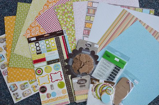
If you missed the Product Challenge during card week and two-page week, Jillibean Soup has provided a kit of the same materials for each of our creative team members. The products we are using in our challenge (pictured below) are:
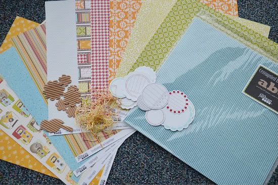

• Five sheets of patterned paper from the Pasta Fagioli collection.
• One sheet of Brown Pea Pod kraft patterned paper
• Blue Corrugated Alphabets
• Corrugated shapes
• Journaling Sprouts in red, green, blue, and brown
• Bean Stalks twine in orange and yellow

Together with the February sketches we have shown you how using the same products and even the same sketches can produce so many different results. We also came up with a list of basic supplies that would be okay for use with the product challenge like cardstock, punches, die cutting machines, paint, ink, etc.

Since it is one-page week all of the projects we are posting today are based on One-page Sketch #3.
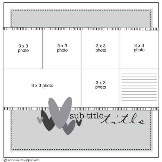

You can download and print this sketch by clicking on the one-page sketches link found under the "printable sketches" tab on the right sidebar.
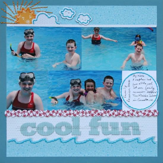

"Cool Fun" by Shari Thurman
Supply list - Pattern paper, Corrugated Alpha, Journaling Sprouts: Jillibean Soup; Paper Punch: EK Success; Embroidery floss: DMC; Other: Cardstock, Cricut, machine and hand stitching

These photos of my nieces and nephew from 2006, were just begging to be scrapbooked. When I saw the fresh color palette from Jillibean Soup "Pasta Fagioli" collection, I knew it was time.

I added the hand stitched sun and clouds as embellishment to the corner of the layout and added the wave to the bottom to create a fun water scene.
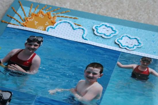

 I stitched through the circle border along the bottom of the photos, suggesting beach balls. I adjusted the photo sizes. Added the title to the bottom and stitched through it, just to add texture and interest.


• • • • • • • • • • • • • • • • • • • • • • • • • • • • • • • • • • • • • • • • • • • • •
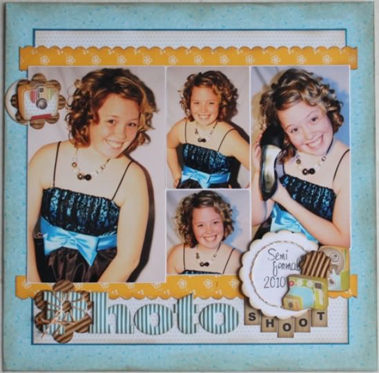

"Photo Shoot" by Carolyn Wolff
Supply List -  (All supplies were from the product challenge kit from Jillibean);  Cardstock: Bazzill; Border punch: Fiskars

I loved this sketch and I wanted to create the one-page sketch using all the products we received in our challenge kit from Jillibean. As soon as I saw the paper with all the cameras on it I thought of two things, a photo shoot and cutting them out!

Variation #1 – In order to accommodate the photos that I had, I needed to change the layout of the photos. I still kept the photo area in tack, but I just changed the size and direction to suit my needs.

Variation #2 – I eliminated the journal area in the photo block and added a journaling sprout as one of the embellishment areas.

Variation #3 – I created three embellishment areas on my page to create some dimension and interest. The first is in the upper left corner. I layered a journaling sprout, a corrugated flower and a camera that I cut from the pattern paper. The second area is the title. I created and embellishment out of the first letter in my title. The third is my journal area in the lower right. I layered the different elements, added some stitching with the bakers twine and even incorporated part of my title.
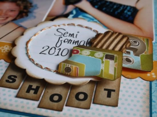

The biggest challenge for me was not using anything to embellish except what was in the challenge kit. This is a great way to make your own embellishments and by layering and using foam adhesive you can create the interest you are looking for.

• • • • • • • • • • • • • • • • • • • • • • • • • • • • • • • • • • • • • • • • • • • • •
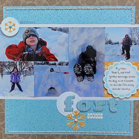
 
"Fort Larson" by Jennifer Larson
Supplies - Patterned paper, journaling spots, twine, corrugated letters: Jillibean Soup; Snowflake die (small): Quickutz; Snowflake punch (large): EK Success/Stampin' Up!; Pen: Zig; Stamping ink: Stampin' Up! Other: brads, date stamp.

1. I had fewer photos, so I enlarged one photo to stretch over two spots. I also changed the arrangement of the photos.

2. I didn't want to use hearts, so I dug through my plethora of snowflake dies and punches to put a big snowflake on the bottom. I picked orange because it complements blue nicely.
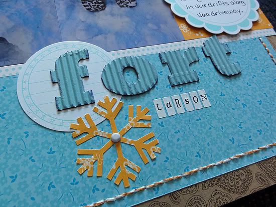

3. I added the small orange snowflake in the upper right to create a visual triangle, along with the journaling sports.

4. I added stitching around the edge to add texture to the page.

• • • • • • • • • • • • • • • • • • • • • • • • • • • • • • • • • • • • • • • • • • • • •
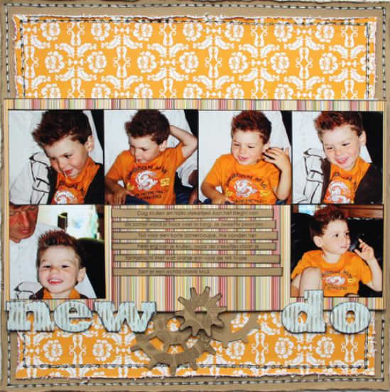

"New Do" by Mireille Divjak
Supply list (apart from the Jillibean Soup products) - Sizzix dies: Tim Holtz alterations, gadget gears;
ink: Colorbox; Paint: Ranger paint dabber; pens: American Craft and Sakura

Story: Noah used to have beautiful curly hair but also very, very thick hair. In the summer he started to sweat so much we decided, with much pain in our hearts, that it would be wise to give him a haircut.
He came back with short hair... bye bye curls. But, we thought he looked really neat after a while
especially since he got orange hair gel to support the dutch soccer team in the World Cup finale.

Here's a look at some of the details on the layout:


• • • • • • • • • • • • • • • • • • • • • • • • • • • • • • • • • • • • • • • • • • • • •


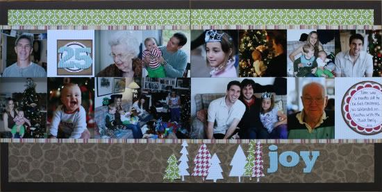
"Joy" by Noey Hunt
Tools used: Trees cut with Cricut

Variation: I have lots of photos that I loved from Christmas and really wanted to incorporate them all so I stretched Allison's sketch into a two-page layout. It may have made the layout a bit chaotic with all of those photos, but that's what Christmas day was like, utter chaos!

• • • • • • • • • • • • • • • • • • • • • • • • • • • • • • • • • • • • • • • • • • • • •

"Silly Faces" by Christy Arthur
Supplies - Jillibean Soup: Soup Staples Brown Pea Pod, Blue Corrugated Alpha, Orange and Yellow Bakers Twine, Journaling Sprouts, Corrugated Shapes and Pasta Fagioli: Blended Beans, Shell Macaroni, Italian Seasoning, Romano Cheese and Meatballs; Ink: Colorbox Chestnut Roan Chalk Ink; Pen: American Craft Precision Pen Black; Mist: Studio Calico Mister Huey Mist: Schoolhouse, Applejack and Dark Calico

The product challenge was fun and I had to keep reminding myself not to reach for other tools and paper! I was surprised with how diverse the layout turned out with such a limited amount of supplies! The photos that I used fit perfectly with the fun papers from Jillibean Soup. They are from my daughter's 6th birthday when she and her daddy were waiting to ride in the go-karts at a local pizza place. These are the silly faces they captured on his cell phone.

My layout looks a little different from the sketch because I rotated the sketch 90 degrees, so the photos were in a vertical line. Then I used three photos instead of the six in the sketch and pushed them along the right side of the layout. I pieced together six sheets of different patterned paper to create the background paper. I also rounded the corners of the top and bottom strips of paper, as well as the top of the photos. I added a little hand stitching along the top and bottom strips of paper, instead of stitching along the entire piece of paper.

To make the title stand out a little more against the bright patterned paper, I misted the corrugated alphabet brown (it was originally blue). I also misted the flower and bird shapes to give a little variation.

I moved the journaling over slightly and layered two journaling spots on top of each other. I liked how you flip up the date spot to show the "story" journaling underneath. I also added a little stitch to hold the two journaling spots together, as well as a little stitch on the flowers.
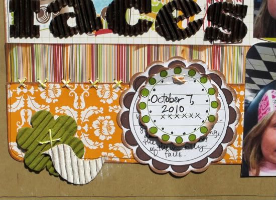

 Finally, I drew a border line around the edges of the background paper and added a little stitch detail in pen to mimic the stitching around the layout.

• • • • • • • • • • • • • • • • • • • • • • • • • • • • • • • • • • • • • • • • • • • • •
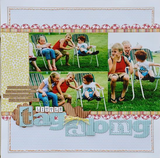

"Little Tag Along" by Allison Davis
Supplies - Cardstock: Bazzill; Patterned paper: Jillibean Soup; Corrugated shapes: Jillibean Soup; Corrugated alphabets: Jillibean Soup; Twine: Jillibean Soup


Variation #1 - I flipped the sketch for my layout to keep the subjects in the pictures from looking off the page.

Variation #2 - Instead of using the six photos on the sketch, I used three: one 4 x 6" and two 6 x 3". That left me with a hole to the left of the pictures so I filled it in with a 2 x 6" piece of patterned paper. I tried to use a pattern and color that blended well with the pictures so it wasn't too distracting but instead meshed with the pictures.

Variation #3 - I added the red patterned paper scallop to the edge of the striped strips to incorporate some more color into the layout.

A few little details:

• I used the negative of some of the letters in my title by cutting them out of the alphabet sheet. I had ran out of a few letters that I needed for my title and I figured this was the next best thing. I also added some hand stitching inside the letters.
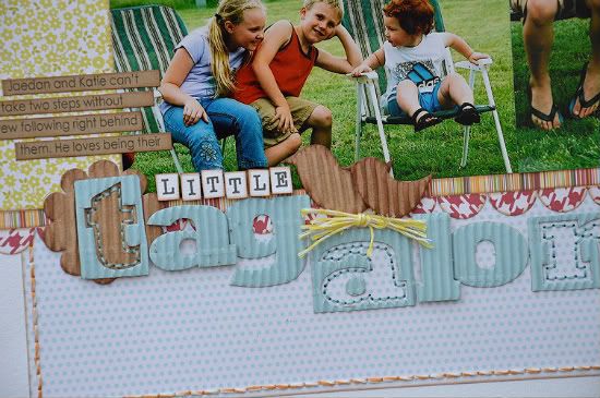

• I used two of the corrugated birds to accent the title. I used a bigger bird to represent the bigger kid and the smaller one to represent the tag along, Drew. To keep the birds from just floating there above the title I added a little nest made from the Jillibean Soup twine. I cut several pieces around the same length and then wrapped and tied another piece around them in the middle.

• • • • • • • • • • • • • • • • • • • • • • • • • • • • • • • • • • • • • • • • • • • • •


"How 2 Eat Spaghetti" by Jill Sarginson
Supply list - Kraft Cardstock: Jillibean Soup; Patterned Paper: Jillibean Soup, Pasta Fagioli; Alphabets: Jillibean Soup, Pasta Fagioli, blue corrugated alpha; Ink: Versamark; Pen: Zig Writer; Embellishments: Jillibean Soup; Miscellaneous: Pop dots

Variation #1: I printed out my photos as 3x3 however I opted for a fax print vs. a photo print and it made my photos smaller than 3x3. This was unintentional and resulted in some open space on each side of the photos. :)

Variation #2: Instead of having the 8th square as a journaling box, I opted to use one of the tags from Jillibean Soup. There are a lot of square elements to this sketch, I wanted to add a little circular touch.

Notes: the sub-title was made by cutting little squares out of the pattern paper, inking the edges and then writing my title on. This is a really fast and easy way to get co-ordinating alphas for your projects!

• • • • • • • • • • • • • • • • • • • • • • • • • • • • • • • • • • • • • • • • • • • • •
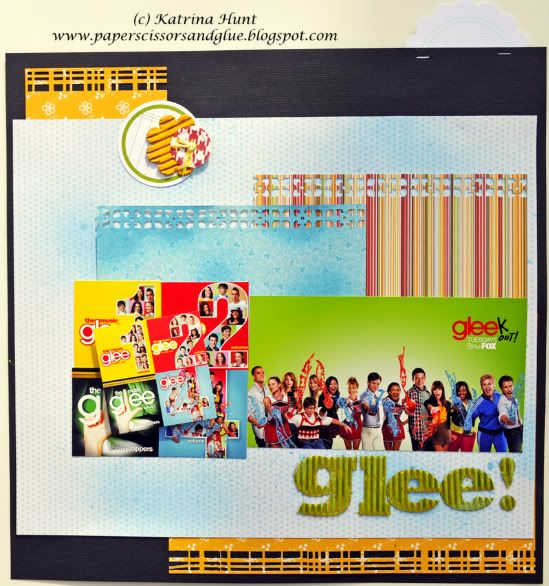

"Glee!" by Katrina Hunt
Supplies - Cardstock: American Crafts; Patterned Paper: Jillibean Soup; Journal Spots: Jillibean Soup Sprouts; Corrugated flower: Jillibean Soup; Corrugated Letters: Jillibean Soup; Twine: Jillibean Soup; Punches: Martha Stewart and EK Success; Mist: Smooch Spritz; Paint: Ranger Paint Dauber; Adhesive: Scotch ATG, FabriTac, Ranger Pop Dots; Stapler: Tim Holtz Tiny Attacher


So, I had to have a layout made about my Tuesday night obsession! It’s out, yes I am a Gleek! Scrap your favorite things like hobbies, books, drinks (Starbucks is a popular one), shoes (yes I have scrapped my shoes!) I am a kidless scrapper, unless I use other peoples kids! My kids are my dogs so yes, you will see a lot of them, but I like scrapping everyday things also!

At first glance of the one page sketch, I thought what the heck am I going to scrap with that many pictures. But, remember, you do not have to use as many pictures as the sketch calls for, you can put embellishments, journaling (which you are finding I don’t do a lot of!), you can do the same picture over and over, pattern paper the size of the picture, or just leave the picture out entirely. Don’t be afraid to make a sketch your own! Sketches are for inspiration and it’s up to you to make your own creation!

I love the bright colors they use for the Glee CD covers, so I decided to scrap them. (Yes, I have them all!) I resized each cover in Photoshop elements and kept each cover as a separate picture. I then created a collage of all them, so that I could just cut the collage square. The big picture came off of the show’s sites under their download section.
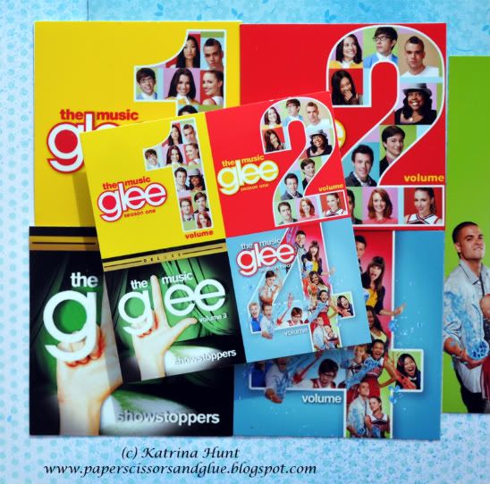


And the Jillibean paper worked great with the covers! I misted the smaller background to make it look like a blue slushie, if you watch Glee, you know! The letters we received were blue, so they didn’t stand out on what I had done, so I misted them a bright green.

At first glance you think this is not like the sketch, but it is, with modifications!

Katrina http://paperscissorsandglue.blogspot.com

Variations on the sketch:

• Inner background: I used sections of paper and had them peeking out at top and bottom, but if you are to look at the top of the page down to the bottom, you can envision it being a “complete” background piece.

• Instead of having smaller strips at top and bottom of picture line, I left mine bigger by including a background that was smaller than the first one. And then I added a couple of strips at the top of the pictures, but did not take them all the way across.

• The picture placement looks totally different but if you flip the right side of the sketch with the left, just in the picture placement, you will see where I came up with what I did. It’s just the right side of my page, the picture section is slightly smaller than the left. And then I placed the collage on top of the other picture with some pop dots.

• The title is in the same place, just no subtitle. Also no embellishments where the hearts are on the sketch. I felt that my pop dotted collage took the place of that. And I added ½ of a sprout at the top of my page with a staple, kind of looks like a tab!

• • • • • • • • • • • • • • • • • • • • • • • • • • • • • • • • • • • • • • • • • • • • •

Are you ready for a challenge? 
  
This week our challenge for you is a color challenge and we are using the Jillibean Soup Pasta Fagioli collection as the inspriation. 

Using One-page Sketch #3, create a layout with the following color combination:
• red
• orange 
• blue
• green
• brown

You can use any products you want from any manufacturer you want. 
After you have created your project: in the comments post a link to your project (it can be in an online gallery or on your blog).

This week we are giving away a copy of Sketches for Scrapbooking, Volume 7 (our newest sketch book in the Sketches for Scrapbooking series) to the winner of the challenge.

You have until Friday, March 4 to link your project from the challenge and we will announce the winner on Sunday, March 6. We look forward to seeing your layouts!
•••••••••••••••••

Friday, February 11, 2011

Two-page Week, Part 5 - Jillibean Soup Product Challenge

It's time for our Jillibean Soup Product Challenge! We're sharing another round of our projects from the challenge and have another challenge for you too.

If you missed the Product Challenge during card week, Jillibean Soup has provided a kit of the same materials for each of our creative team members. The products we are using in our challenge (pictured below) are:


• Five sheets of patterned paper from the Pasta Fagioli collection.
• One sheet of Brown Pea Pod kraft patterned paper
• Blue Corrugated Alphabets
• Corrugated shapes
• Journaling Sprouts in red, green, blue, and brown
• Bean Stalks twine in orange and yellow 

Together with the February sketches we are going to show you how using the same products and even the same sketches can produce so many different results. We also came up with a list of basic supplies that would be okay for use with the product challenge like cardstock, punches, die cutting machines, paint, ink, etc. 

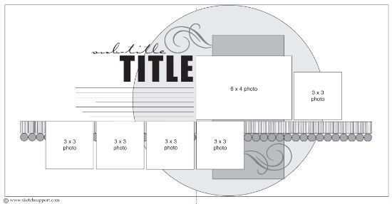
Since it is two-page week all of the projects we are posting today are based on Two-page Sketch #8. 


 You can download and print this sketch by clicking on the two-page sketches link found under the "printable sketches" tab on the right sidebar.


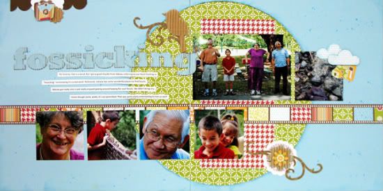
"Fossicking" by Suzanna Lee
Supplies - Patterned paper: Jillibean Soup; Mist: Tattered Angels; Ink: Tim Holtz Distress Ink, Ranger; Tools: Sizzix die cut

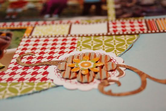
I didn't deviate too far from the sketch (for a change!). I added the embellishments and border at the top left of the layout. And rather than use the stripped strip with the circles I used the negative strip. I like it moving all the way across the page so as to "ground" the layout and move the eye across the page. I spiffed up the swirls with an added embellishment.


 Another embellishment cluster was added to the top 3x3 photo.

• • • • • • • • • • • • • • • • • • • • • • • • • • • • • • • • • • • • • • • • • • • • •


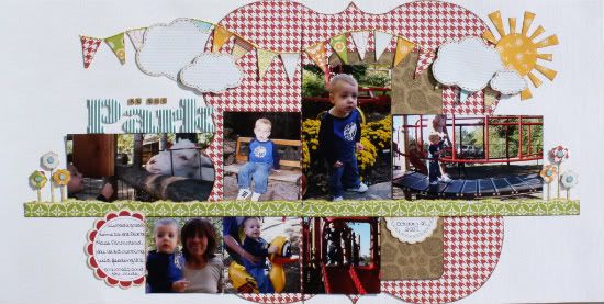
"At the Park" by Christina Hoffman
Supply List - Cardstock: Bazzill; All other products: Jillibean Soup

Variation 1 - Instead of the giant circle I traced a die cut paper to create my own die cut paper.

Variation 2 - I changed some of the picture sizes and added more to accommodate the pictures I had to work with.

Variation 3 - I used a Journaling Sprout in place of the fourth picture on the bottom.

Variation 4 - I only used one strip instead of a striped strip and a decorative strip on the sketch. I wanted it to look like grass so I felt it would be too busy if I used more than one strip.

• • • • • • • • • • • • • • • • • • • • • • • • • • • • • • • • • • • • • • • • • • • • •

 
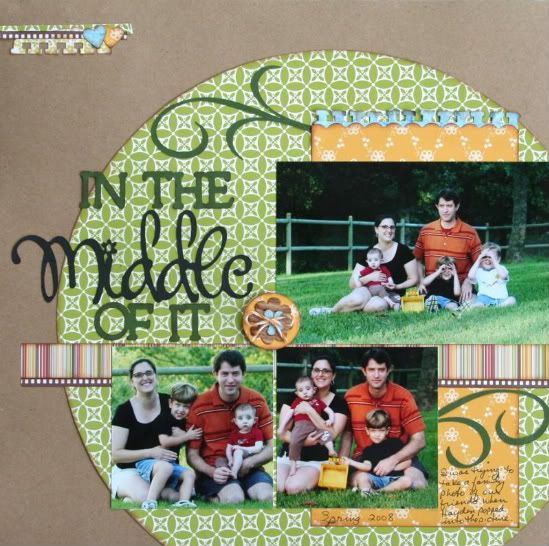
"In the Middle of It" by Shari Thurman
Supplies - Pattern paper, Bakers twine and Corrugated shapes: Jillibean Soup; Punches: EK Success and Fiskars; Ink: Colorbox Chalk Ink; Cardstock: Stampin' Up; Other: Cricut- Lyrical Letters and Wild Card (flourish)

I love these family photos I took of our friends, especially the one with my son in it. We kept him out of the photo for as long as possible. He couldn't control himself and had to plop right down next to his friend and pretend to take pictures of me.

Sometimes I will take a one-page sketch and stretch it, but this time I took a two-page sketch and cropped off the left and right side and used the middle. I used the circle in the sketch as my starting point and adjusted the photos and elements a bit. I let my 12 inch circle overlap my background on the right side and the bottom and then trimmed the edges. Doing this eliminated the smaller photo on the far right and the 2 smaller photos on the far left. Since my circle was now shifted to the right, I needed a little something in the top left corner to balance the layout. That is why I added the 3 small strips of paper and 2 tiny hearts. My stripped paper is cut to 11 1/2 inches.

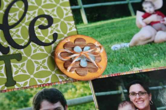
I just loved the flourishes in the sketch, so I used them as suggested. I punched a border on the 4 1/2 x 9 inch of pattern paper. I then layered it with the blue paper to add another dimension of color, because it was starting to look a little flat. I cut the title with my Cricut. Since my title was so big, I moved my journaling to the lower right. I then added the layered Corrugated flower embellishment to the middle of the layout to help support the title and add a little something extra.


• • • • • • • • • • • • • • • • • • • • • • • • • • • • • • • • • • • • • • • • • • • • •


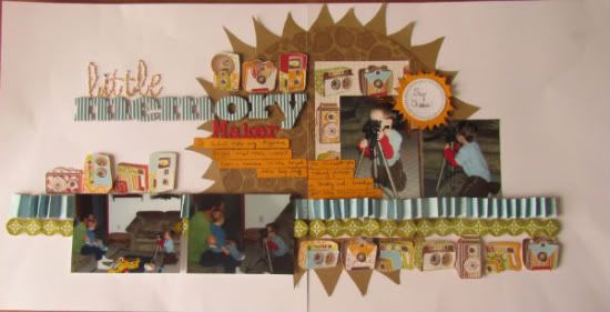
 "Little Memory Makers" by Amy Roller
Supplies - All patterned papers: Jillibean Soup; Cardstock: Close to My Heart, We R Memory Keepers

Variation #1: I stayed with the circle background but because of the triangles I added around the edge for the "flash" effect, I had to make the circle base smaller.

Variation #2: I only had four pictures of this event so I ultimately had to go with fewer pics. The photos I had were also horizontal and so it worked out better leaving them wider so that they helped fill in that void that using fewer pictures caused.

Variation #3: Instead of the stripe we had in our package, I opted to make my own "stripe" buy folding a strip of the blue flower paper.


 I felt it looked like a stripe but added movement to the page and matched my pictures better. I adhered this in place of the stripe on the sketch. I stuck with the circles shown and cut them out of another patterned paper and popped them up.

Variation #4: Next I decided the cameras on the background strip behind the largest picture followed my theme so well that I had to cut some of them out to add another strip across the page in several locations. This sort of draws your eye around the page. They also fill in for the swirls on the sketch.

I had my journaling area float across the layout to draw your eye over. It also conveniently covers up a distracting object in my largest picture.

• • • • • • • • • • • • • • • • • • • • • • • • • • • • • • • • • • • • • • • • • • • • •


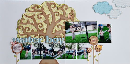
"Water Boy" by Allison Davis
Supply list - Cardstock: Bazzill; Punch: Martha Stewart; All other products: Jillibean Soup

This is one of those pages that at first glance you might think it looks nothing like the sketch. I kept a little of the sketch, took a little out, and added a little extra. The idea definitely stemmed from the sketch, I just happened to let my creativity take over.

Variation #1 - I decided to make a huge tree to use in place of the circle. Since the tree was such an important part of the theme I didn't want to cover it up with pictures. Moving it to the left page was an easy solution.

I'll openly admit when I mess up. I was so mad at myself when I was about halfway done with this layout. The tree was a fun idea and I was so anxious to see the finished result, that I didn't pay attention to the normal details that I am usually very aware of. Yes, that is my son facing off the page. And after I've said it several times that I never do that! I was kicking myself for not flipping the sketch. Especially when I realized that he would have been facing the tree and it would have looked like he was watering the tree on the page. What can I say? The creative side of my brain was too excited and going to fast for the other, logical side of my brain to keep up.

Variation #2 - I had a lot more pictures I wanted to add so I cut them to 2 x 3 instead of 3 x 3 as the sketch suggests.

Variation #3 - One of my favorite things to do from time to time is to create a scene or landscape and that's what I did with this layout. That is why I decided to remove the strips and the rectangle piece on the sketch. To finish out the landscape I added flowers to the bottom of the page, a few clouds to the top right corner, and a few butterflies.

• • • • • • • • • • • • • • • • • • • • • • • • • • • • • • • • • • • • • • • • • • • • •


"Thomas" by Mireille Divjak
Supplies - Cardstock: Bazzill; Glimmer Mist: Tattered Angels; Sizzix dies: Tim Holtz alterations, gadget gears; Ink: Colorbox; Punch: EK Success; Pen: Staedler; All other products: Jillibean Soup

• I sprayed some glimmer mist on my cardstock and made it "messy" so I could accentuate the drips with a fine liner.

• The wall is hand drawn

• I used the Jillibean twine it to sew on the strip.

• I distressed the title. (just LOVE those alpha's, really really amazing!)

Story:

Noah is so in love with his Thomas the Tank Engine trains He plays with them everyday and takes them to bed when he goes to sleep. He got Knapford Station and a few new trains from Santa and then
it hit me, I've never scrapped Thomas before, so this was a "have to".

• • • • • • • • • • • • • • • • • • • • • • • • • • • • • • • • • • • • • • • • • • • • •


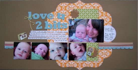
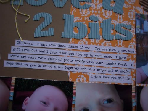
"Love U 2 Bits" by Melissa Elsner
Supplies - Cardstock: Recollections; Patterned Paper, alphabet, corrugated chipboard, journal spot, twine: Jillibean SoupElectronic Cutter: Silhouette SD; Punch: EK Success; Font: Urania Czech

Variation #1: Instead of a circle, I traced the shape of some paper from my stash to create the scalloped base.

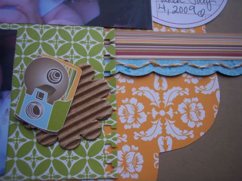
Variation #2: The Silhouette has a lot of really cool faux stitching templates. I tweaked it a bit by making it work to actually hand stitch. The shape is a scalloped strip and I placed the holes at intervals to make the stitching even. Then used the bakers twine from Jillibean to create the stitching.


Variation #3: The cameras were too cute! I cut them out and used a couple as embellishments on the page. They worked perfectly due to using limited supplies and they were the perfect addition to this layout.


• • • • • • • • • • • • • • • • • • • • • • • • • • • • • • • • • • • • • • • • • • • • •


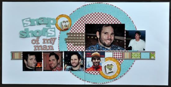
"Snapshots of My Man" by Jill Sarginson
Supply list - Cardstock: Bazzill; Patterned Paper: Jillibean Soup - Pasta Fagioli; Alphabets: Jillibean Soup; Ink: Versamark; Embellishments: Jillibean Soup; Tools: Creative Memories circle cutter; Other: Pop dots

Variation #1: I opted to layer the large circle. I used the red hounds tooth paper as a base and then put the blue pattern paper on top. I didn't think it popped enough so using a circle cutter, I cut another circle out of the base paper and placed it on top (as the top layer). The sketch used a rectangular piece however I opted to go circular (I love circles!).

Variation #2: I replaced the swirls with some circular embellishments and hand-cut embellishments (cameras) from the pattern paper.

• • • • • • • • • • • • • • • • • • • • • • • • • • • • • • • • • • • • • • • • • • • • •

 Now it's your turn!

This week the challenge for you is similar to the challenge we took on with the products from Jillibean Soup.

Using Two-page Sketch #8, create a layout that includes EACH of the following supplies:

• patterned paper
• chipboard
• a journaling tag or die cut
• twine or ribbon
• flowers

You can use any other products you would like along with the product challenge supplies.

After you have created your project: in the comments post a link to your project (it can be in an online gallery or on your blog).

This week we are giving away an awesome Jillibean Soup prize package to the winner of the challenge. 
The giveaway includes many of the product we used in our product challenge and more.

You have until Friday, February 18 and we will post the winner on Sunday, February 20.

Friday, February 4, 2011

Card Week, Part 5 - Jillibean Soup Product Challenge

 ••••••••••••••••••••••••••••••••••••••••••
Are you ready for a little challenge? Sketch Support and Jillibean Soup have come together to present a product challenge for our creative team and for you too.

Jillibean Soup has provided a kit of the same materials for each of our creative team members. The products we are using in our challenge (pictured below) are:


• Five sheets of patterned paper from the Pasta Fagioli collection.
• One sheet of Brown Pea Pod kraft patterned paper
• Blue Corrugated Alphabets
• Corrugated shapes
• Journaling Sprouts in red, green, blue, and brown
• Bean Stalks twine in orange and yellow

Together with the February sketches we are going to show you how using the same products and even the same sketches can produce so many different results. Each week on Friday, (except for the add-on week), we will post our product challenge projects based on the sketch for that week.

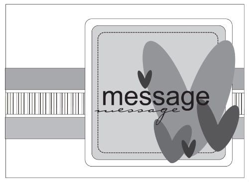
Today all of the projects for the product challenge are based on the card sketch we've been using this week. There is a lot to share so sit back, get comfortable, and enjoy!


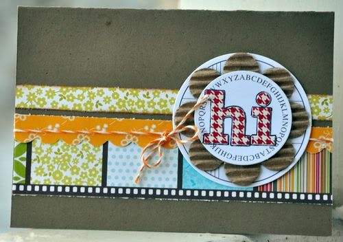
"Hi" card by Jill Sarginson
Supply list - Kraft Cardstock: Jillibean Soup; Patterned Paper: Jillibean Soup - Pasta Fagioli; Alpha's: Jillibean Soup - Pasta Fagioli; Twine: Jillibean Soup; Embellishments: Jillibean Soup; Ink: Versamark

Variation #1: I used three horizontal pieces of pattern paper but I opted to layer the middle one over the bottom layer. To finish it off, I also tied the twine around the entire card.

Variation #2: Instead of using a square embellishment, I opted to go circular. I used a Journaling Sprout from Jillibean Soup and then layered a corrugated flower and another Journaling Sprout on top.

• • • • • • • • • • • • • • • • • • • • • • • • • • • • • • • • • • • • • • • • • • • • •

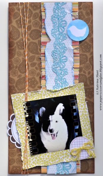
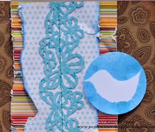
6 x 12 layout by Katrina Hunt

I was excited about the project challenge between Jillibean and Sketch Support. I love Jillibean, but haven’t worked much with her products. They are always sold out when I try to get them! And this collection, Pasta Fagioli, I have loved since the moment it came out. I had it in my head I was going to use those camera, but when I started creating, my projects took a whole different direction!

Speaking of a whole different direction, have you ever made a 6 x 12 layout? You could call it the “black sheep” of the scraping sized layouts, but so fun! This size can be a challenge if you are like me and like “stuff” on your pages! You have minimal amount of room to add things! But when I saw the card sketch, I knew that I wanted to do just that. And please, if you decide to try it, link it up here or contact me through my blog I would love to see it!

Hugs, Katrina  www.paperscissorsandglue.blogspot.com

And don’t forget to pull those pictures off your camera phones! That is where this picture I used came from. Some of the apps have such fun features and take some fun pictures that you might not otherwise have taken in the moment!

Variations:
• The obvious, flipped the sketch. It would have worked either way with the layout, but I wanted to flip it!

• Obvious #2, no sentiment, no title. I don’t feel like I have to title every page, especially if I am just creating to create. I love the look of this without the title. And truthfully, I scrap pictures more than once. Chances are this is one of those that is going to get scrapped again, and you may see it on here!

• Added the twine around the page on the side. This is not on the sketch. I am a ribbon, twine, etc. girl, so I always tend to add it to sketches.

• I added the Jillibean Sprout in a random spot, the blue bird at the top.


I took a sprout, turned it over, and using a corrugated bird shape that was in my package as a mask, misted to create a negative shape.

• I don’t “measure” exactly by the sketch, no one is going to put you in time out if you don’t either! I also offset my center strip compared to the sketch, it’s what I felt like at the time!

• • • • • • • • • • • • • • • • • • • • • • • • • • • • • • • • • • • • • • • • • • • • •


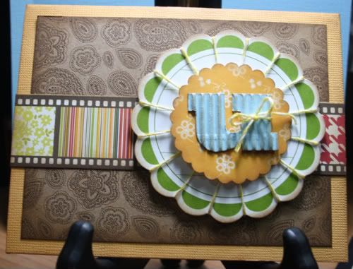
"U" card by Carolyn Wolff
Supply List - Cardstock: Bazzill; Ink: Ranger Distress Ink, Vintage Photo; All other supplies: Jillibean Soup

Variation #1 – To the card base, I added a layer of pattern paper. I chose the paisley print. The pattern measures 3 ¾ x 5 inches.

Variation #2 – I replaced the 3 strips of paper in the middle of the card with one strip of the pattern that resembles a film strip. The different patterns gave my card a nice splash of colour.

Variation #3 – For the main ‘message’ part of the card, I used one of the large journaling sprouts and wrapped some of the yellow bakers twine around each scallop to create some texture.


 I punched out a scalloped circle from the orange floral pattern and layered it on top of the large sprout. I tied some of the yellow twine to the letter ‘u’ and attached it to the center of the orange scallop.

The reason that I chose to use the letter ‘u’ is for flexibility. When I use the card, the letter will give me many options, ’u’ rock! ‘u’ make me smile! ‘u’ are too cute! See what I mean.

This card sketch is so versatile. I love the clean and simple design. Thank you to Allison and Jillibean for a great product challenge.

• • • • • • • • • • • • • • • • • • • • • • • • • • • • • • • • • • • • • • • • • • • • •


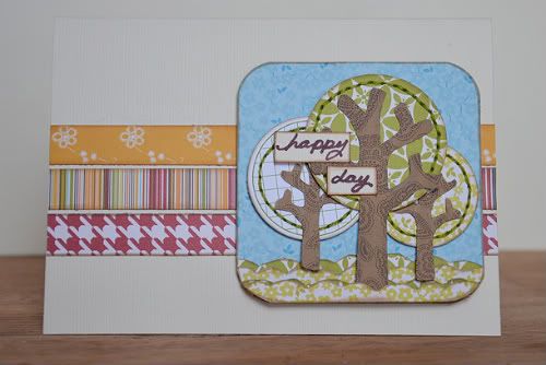
"Happy Day" card by Allison Davis
Supply list - Cardstock: Bazzill; Pen: American Crafts; Embroidery floss: DMC; All other supplies: Jillibean Soup

Variation #1 - Instead of using the hearts on the sketch I made trees with circles punched from the Jillibean patterned paper and a Journaling Sprout as my tree tops.

Because it's is almost impossible for me to not stitch on things, I added hand stitching around the circles. I think hand stitching is such an easy way to enhance a simple shape.

I was relying on the blue square to look like blue sky behind the trees and to help paint that picture I added small scallops at the bottom for grass.

• • • • • • • • • • • • • • • • • • • • • • • • • • • • • • • • • • • • • • • • • • • • •


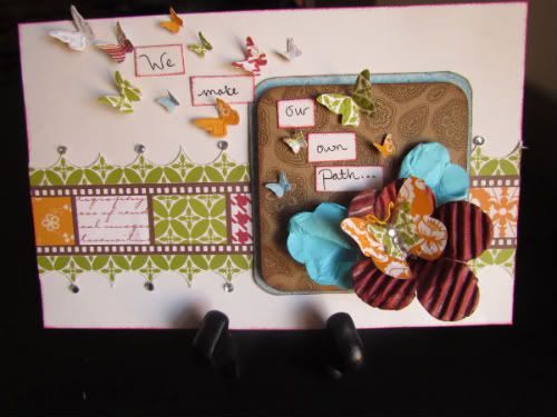
"We Make Our Own Path" card by Amy Roller
Supplies - All pattern paper: Jillibean Soup; Cardstock: Stampin UP!; Die: Stampin Up!

Variation #1: For the product challenge using the card sketch, I changed several dimensions because I didn't make it as a card, more of a piece of art to frame. Although I am notorious for making actual cards you can't mail. I have trouble making things flat. I needed a little more room across the card to use the butterflies the way I wanted so the first variation I made was to the overall card size. It ended up being 5 x 8 . For the squares, I used the largest square dimensions for the smaller square and made the large square 1/4" larger. I used pop dots on the smallest square.

Variation #2: I also changed the measurements for the stripe and border around it. Because it was close to the same size, I cut a strip out of the filmstrip patterned paper to use as the stripe and then cut out along the green pattern to use as the border.

Variation #3: I changed the embellishment placement and added extra butterflies floating away from it as well as my message. For the flower, I first sprayed the corrugated shape with Red Velvet Glimmer Mist and then cut out 1 petal. I then pulled the next 2 petals together with adhesive to form the shaped base. Next I turned over a scalloped journaling spot and misted it with Jazz Blue and crumpled it
up. Then I cut it in 1/2 and folded each piece together to form "leaves". The butterflies are all diecut/embossed.

• • • • • • • • • • • • • • • • • • • • • • • • • • • • • • • • • • • • • • • • • • • • •


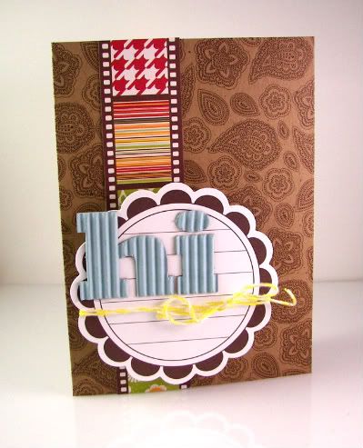
"Hi" card by Melissa Elsner
Supplies - Patterned Paper, Journal Spot, Alphabet, Twine: Jillibean Soup

Variation #1: I chose to flip the sketch this time and take a different approach.

Variation #2: The journal sprouts from Jillibean Soup are perfect for so much more than just journaling. I used the larger sprout in place of the square on the card and popped it up.

Variation #3: There is a lot of pattern going on with the kraft base and strip so I chose to leave it as simple as possible for the top with the sentiment. Thankfully, Jillibean's corrugated alphabets are awesome enough to stand on their own.

• • • • • • • • • • • • • • • • • • • • • • • • • • • • • • • • • • • • • • • • • • • • •


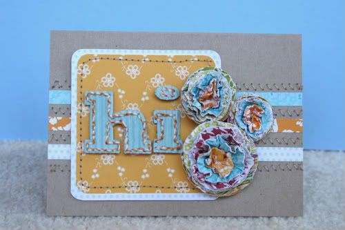
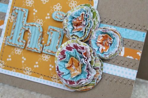
"Hi" card by Shari Thurman
Supplies - Pattern paper, Corrugated Alphabet and Bakers Twine: Jillibean Soup; Circle Punches: Stampin' Up and EK Success; Tools: We R Memory Keepers Corner Chomper and brad setter/paper piercer

When I first saw the product for this challenge, it made me feel bright and happy like flowers do, so I knew I wanted to make paper flowers for my card. I attached three 1/4 inch strips to the card and zig-zag stitched between the strips. I attached my squares to the left side of the card to allow space for my flowers. I hand-stitched with Bakers Twine around the corrugated letters and attached to the card.


Flower tutorial: To make these flowers, punch 8 circles out of different patterned papers. Mist them with water and crinkle. Then open them up enough to stack them. Use a paper piercer to poke a hole in the center and attach a brad. Fold all the circles to the middle and let dry a bit. Then fluff. I used 3 different sized circle punches for my flowers. Instead of circle punches, you can use your Cricut or any other die cutting system to cut your circles. You can also use scalloped circles or flowers for very pretty results.

• • • • • • • • • • • • • • • • • • • • • • • • • • • • • • • • • • • • • • • • • • • • •


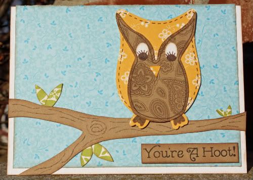
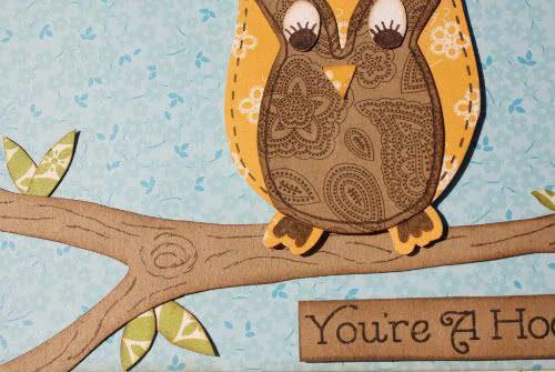
“You’re A Hoot!” by Christina Hoffman
Supply listCardstock: Bazzill; Patterned paper: Jillibean; Font: unknown; Ink: Colorbox Fluid Chalk Ink (Chestnut Roan); Journaling Pen: Unknown

Variation #1 – Instead of using three strips I made a tree limb with two branches in place of the strips and moved them closer to the bottom of the card. The tree limb/branches were free handed.

Variation #2 – I also replaced the squares and hearts with an owl and leaves. I traced the owl then free handed the center part of the owl, the eyes and the leaves.


• • • • • • • • • • • • • • • • • • • • • • • • • • • • • • • • • • • • • • • • • • • • •


"Cheese!" by Allison Davis
Supply list - Cardstock: Bazzill; Embroidery floss: DMC; All other products: Jillibean Soup

I thought the design of this card sketch would also be a fun design for a layout.

I'm so glad I stumbled across these pictures when I was cleaning out the console in my car last week. I had completely forgotten about our silly photo booth pictures and what perfect timing to find them during our product challenge since the Jillibean Soup papers were a great fit with the theme.

Converting a card sketch to a layout is pretty easy. The only downfall is that you obviously have to throw out the measurements. This is one of those times that you really have to use the whole sketch as a suggestion. You can do your own thing to mimic the design and just let the sketch be more inspiration than a guide. 

Variation #1 - Since I was working with a much larger space and because the pictures where so small, I added more strips than the three on the sketch. I also used different sizes of strips instead of three of the same size.

Variation #2 - Another thing I changed due to the larger space I was working with was the largest square. I ended up using a longer piece to help occupy all the empty space and to help the photos stand out. Against the strips the photos were getting a little lost in all the colors.

Variation #3 - I used Journaling Sprouts and cameras cut from patterned paper as my embellishments and arranged them to kind of frame the pictures.

• • • • • • • • • • • • • • • • • • • • • • • • • • • • • • • • • • • • • • • • • • • • •

 Now it's your turn!

During this month we will also have three different challenges for you based on the product challenge. Each week will be a different challenge with a different sketch. So grab your supplies, print the sketch, and have some fun! Your first challenge is:

• Create a project with Jillibean Soup products (any collection or product) based on Card Sketch #3.

After you have created your project: in the comments post a link to your project (it can be in an online gallery or on your blog).

This week we are giving away a copy of our newest card sketch book, Sketches for Cardmaking, Volume 2 to the winner of the challenge. You have until Friday, February 11 and we will post the winner on Sunday, February 13.

We look forward to seeing your creations!
 ••••••••••••••••••••••••••••••••••••