Showing posts with label Tammy Volland. Show all posts

Wednesday, October 5, 2011

Card Week, Part 3

•••••••••••••••

Card Sketch #12


You can download and print this sketch by clicking on the card sketches link found under the "printable sketches" tab on the right sidebar.


"Nice Having You Around" card by Suzanna Lee
Supplies - Cardstock: Bazzill, Coredinations; Embossing Folder: Sizzix; Patterned Paper: SEI, Best Creations, American Crafts, Pebbles Inc; Dimensional Sticker: Pebbles Inc; Misc: DMC floss

Biggest variation for me is it's a card and not a layout! LOL! Some minor deviations; no striped piece running the full length horizontally but the banner in the greeting in it's place. I stitched the outer border instead of the inner.
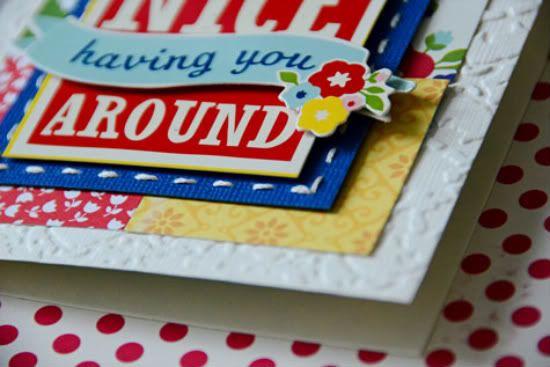

I love the texture that the embossing folder added to the background. I just might be inspired to do more cards!

• • • • • • • • • • • • • • • • • • • • • • • • • • • • • •


"Happy Halloween" card by Melissa Bell
Supply List - Patterned Paper: My Mind's Eye; Brad: My Mind's Eye; Floss: DMC; Chalk Ink: ColorBox; Pop Dots: EK Success; Corner Rounder: We R Memory Keepers; Other: Black Cardstock

I stayed fairly close to the sketch with this card. I love it just the way it is!

Variation #1 - I added another square to the base of the card. I wanted my lighter patterned paper to be framed by the black cardstock.

Variation # 2 - I omitted the stars and swirls. I felt that my happy Halloween square was interesting enough to stand by itself.

• • • • • • • • • • • • • • • • • • • • • • • • • • • • • •
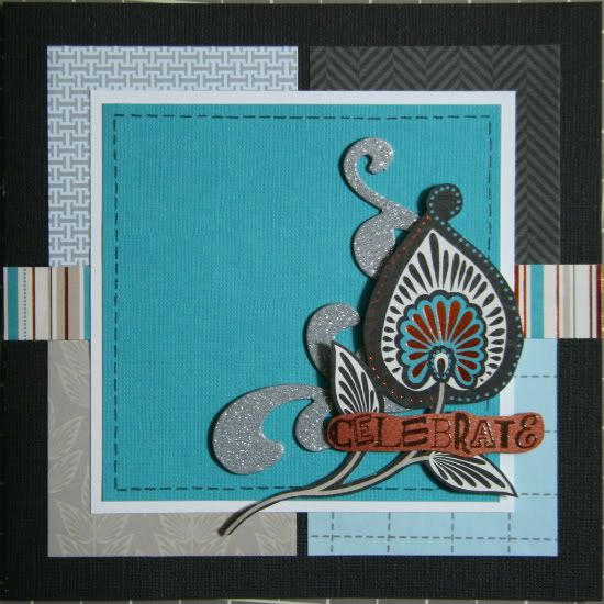

"Celebrate" card by Noey Hunt
Products used -  Patterned paper: SEI; Glitter Accents: Colorbok; Stamp: Fiskars; Embossing powder: American Crafts

Variation 1: Base papers. I ended up separating the background squares of paper because I liked having a break in the pattern. I think this emphasized line also helps draw the eye toward the greeting.

Variation 2: Changing up the stars and title. I decided to cut out this feathery flower from my patterned paper and make it the focus of the card. After using such a vibrant accent for my shape, I decided to simplify the greeting. The heat embossed "celebrate" image worked nicely to complete my triad of embellishments at the focal point on the card.

• • • • • • • • • • • • • • • • • • • • • • • • • • • • • •


"Missing You!" card by Tammy Volland
Supplies - Digital Kit by: Jeanne Maries Scraps, Passing Notes; Software used: Adobe Photoshop CS3; Photoshop Actions: Distressed Edge, Painted Chipboard; Stitching by: Tracy Stroud, All Stitched Up

I had a lot of fun with this sketch! I stayed pretty close to the original, however I used flowers instead of stars. I added drop shadows to all layers.
•••••••••••••••••••••••

Tuesday, September 27, 2011

One-page Week, Part 2

••••••••••••

One-page Sketch #13


You can download and print this sketch by clicking on the one-page sketches link found under the "printable sketches" tab on the right sidebar.


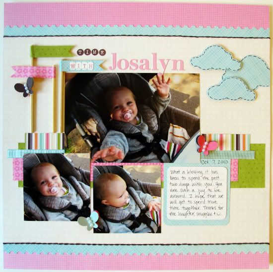
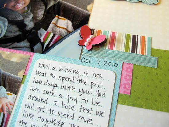
"Time with Josalyn" by Melissa Bell
Supply List - Patterned Paper: Heidi Grace Designs, KI Memories, American Crafts, Little Yellow Bicycle; Letter Stickers: My Mind's Eye and Heidi Grace Designs; Journaling Spot: My Mind's Eye; Border Punch: Fiskars; Ribbon: American Crafts; Floss: DMC; Pearls: Queen & Co.; Pop Dots: EK Success; Other: Wooden Skewers

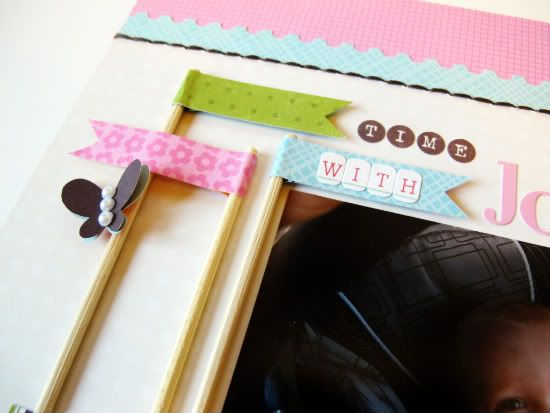
This was such a fun sketch to work with! The minute I saw the flags I knew that I wanted to do something fun with them. I first planned on using toothpicks but found that they weren't long enough. I just happened to have some wooden skewers and cut them to size.


My plan was to pretty much stick to the sketch and follow all of the dimensions. I cut my first clouds out of my creamy background paper and then discovered that I thought the pics looked best against that paper than my first choice. Uh oh! So I trimmed off the part I had cut into and made it work by adding  strips to the bottom and the top of it to make it 12x12. I am very happy with the outcome!


  • • • • • • • • • • • • • • • • • • • • • • • • • • • • • •

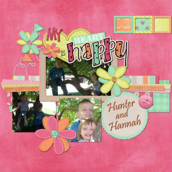
"My Heart is Happy" by Tammy Volland
Supplies - Digital Kit by: Connie Prince / Happy Hearts; software used: Adobe Photoshop CS3

I just love the colors in this kit. Thought is was full of warms and love and worked well with these pictures.

Variation 1) Instead of cloud shapes in the upper corner I would a film stripe and added paper instead of photos.

Variation 2) Instead of stitching I used more ribbon.

Variation 3) I used some flags but not alot and added flowers instead of butterflies.

Variation 4) I added a frame around one of the pictures.

All layers were dropped shadowed at 8. As you all can tell I just love Connie Princes' kits.

  • • • • • • • • • • • • • • • • • • • • • • • • • • • • • •


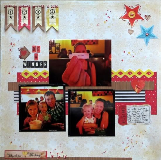
"Be a Winner" by Christy Arthur
Products - Jenni Bowlin: Flag Banner Numbers; Crate Paper: Emma's Shoppe - Books, Dresses, Playhouse and Phrase Stickers, Toy Box - Explore and Borders, Portrait Honeymoon; Jillibean Soup: Bean Stalks Twine; October Afternoon: Mini Market Stickers in Ledger and Black and Cream; Studio Calico: Mister Huey Lemonade and Schoolhouse; Sassafras: Mix, Indie and Bungle Jungle Sweet Treats

I used a similar placement for my photos as are in the sketch. My largest photo is slightly smaller than 5x3, but is placed in the same location.

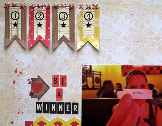
I moved the title in my layout to the left of the large photo instead of on top of the large photo, like the sketch.

I moved my banners to the top left of the layout and used vertical banners instead of horizontal banners like the sketch.


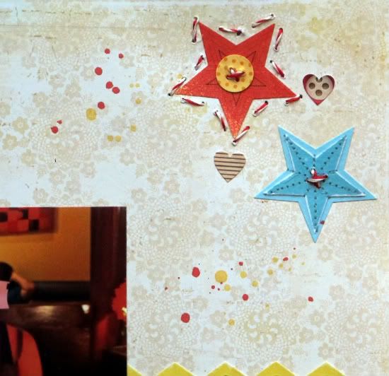
I used stars and hearts instead of the clouds in the top right corner of the layout.


I added a few details along the bottom of the layout which is different from the sketch.

  • • • • • • • • • • • • • • • • • • • • • • • • • • • • • •


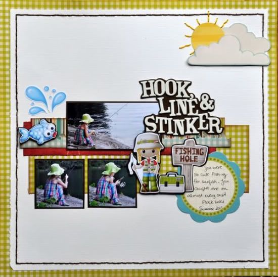
"Hook, Line and Stinker" by Jill Sarginson
Supplies Used - Cardstock: Bazzill Basics; Patterned Paper: October Afternoon, My Little Shoebox; Tools: Fiskars border punch; Ink: Vibrance; Letters: American Crafts; Embellishments: Kristin Aagard's Gone Fishing digital kit; Floss: DMC; Tag: Scenic Route

I reduced the photos to 2x2 (for the two smaller ones) and 4x2 for the larger one. I printed my embellishments from Kristin Aagard's Fishing Hole digital kit and mounted them on brown cardstock and then pop dotted them. The title was mounted on brown cardstock as well and then I cut around the letters, leaving a bit of a border. To help finish off the layout, I stitched a brown border around the edge.
•••••••••••••••••••

Thursday, September 8, 2011

Card Week, Part 4

••••••••••••••••••

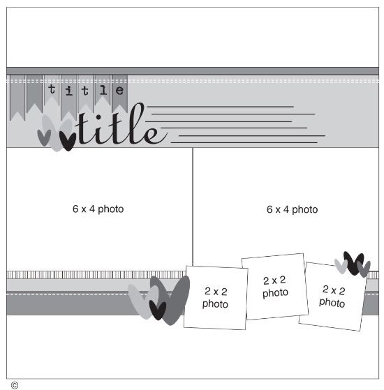
Card Sketch #11


You can download and print this sketch by clicking on the card sketches link found under the "printable sketches" tab on the right sidebar.


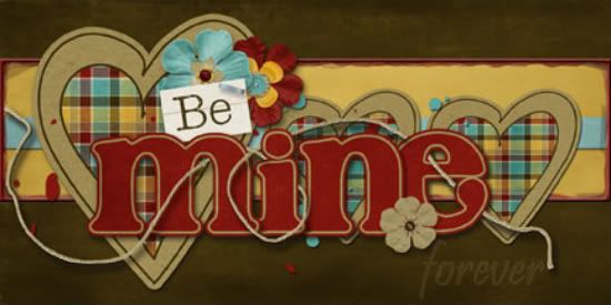
"Be Mine" card by Tammy Volland
Supplies - Digital Kit by: Connie Prince / Who Lives Here; software used: Adobe Photoshop CS3

Well, I know I am off seasons with this one, but I had a friend wanting a "be mine"
card. So I thought this would be a great one for that.

Variation 1) I used hearts instead of the squares. I made one bigger to offset the title.

Variation 2) I added a plastic glass frame around the middle paper piece. You can get the action for Photoshop at www.atomiccupcake.com.

Variation 3) I made the title art (word art with kit) to stand out and faded out the forever part.  I put drop shadows behind all of it to make it look more paperistic (if that is such a word! lol).

  • • • • • • • • • • • • • • • • • • • • • • • • • • • • • •


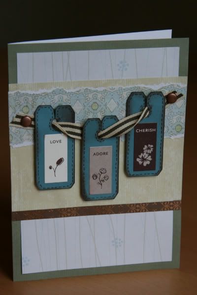
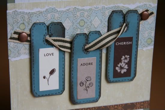
"Love. Adore. Cherish." card by Noey Hunt
Products used - Patterned paper: Paper Reflections (vines), Creative Imaginations, Chatterbox (brown); Stickers: Stampin' Up; Brads: American Crafts; Tools: Cricut Walk in my Garden cartridge (bread tags)

Variation 1: I've been wanting to try out these little bread tags for a long time now and thought three of them together would work well, like in this card sketch. So I switched the row of squares into a line of bread tags hanging on a ribbon.


Variation 2: I rotated the sketch because I wanted my bread tags to stretch across the card but they were too skinny with the horizontal layout.

Variation 3: I had to adjust the widths and placement of the accent paper strips because I needed them to work with the ribbon holding the bread tags.

Variation 4: My bread tags already had words on them that gave purpose to the card, so I dropped the explicit message. But I wanted more brown and a little bling and I accomplished this by added another thin strip below the other accent papers.

  • • • • • • • • • • • • • • • • • • • • • • • • • • • • • •


"Love You More!" card by Shari Thurman
Supply List - Patterned Paper and sticker sentiment: Bella Blvd.; Rhinestones: Kaiser Crafts; Twine: The Twinery; Ink: Colorbox Chalk Ink (Chestnut Roan); Other: Machine Stitching and cardstock

This card measures 4 1/4 x 5 1/2. On this card, I kept the background basically the same as the sketch and stitched around the edges. I lowered the stripes of paper so that they were centered. Instead of adding three embellishments, I used one flower with a sentiment. I attached the flower with 3D foam adhesive and added rhinestones around the circle. I then added twine tied into a bow along the bottom.

  • • • • • • • • • • • • • • • • • • • • • • • • • • • • • •


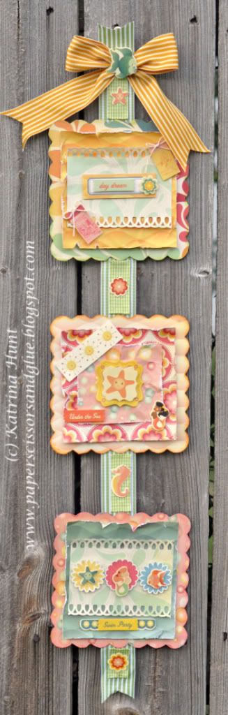
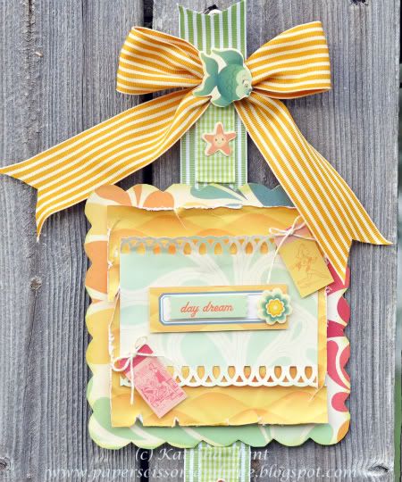
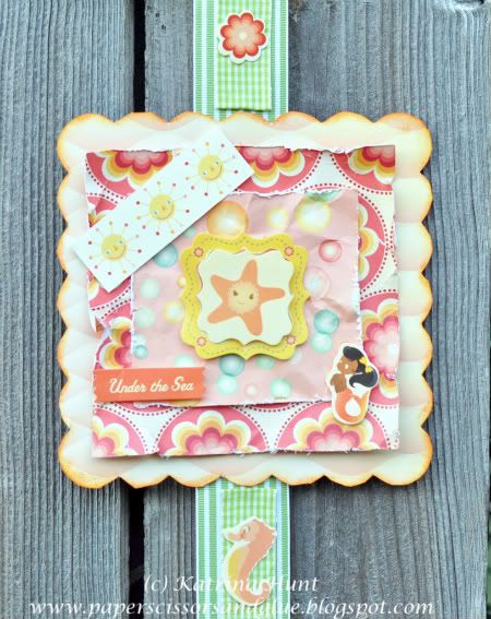
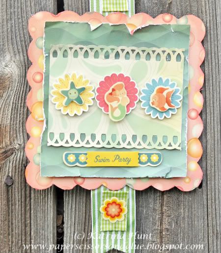
"Swim Party Banner" by Katrina Hunt
Supplies - Patterned Paper: Comso Cricket (Salt Air); Chipboard: Cosmo Cricket Blackboard; Stickers: Cosmo Cricket (Salt Air); Ink: Jenni Bowlin (Chewing Gum, Stick Candy, Chicken Feed); Adhesive: Scotch ATG, Fabri-Tac, Scrapbook Adhesives by 3L; Twine: The Twinery Baker’s Twine; Ribbon: May Arts
As soon as I saw the card sketch, I knew I wanted to make a banner. The three squares on the card just reminded me of a banner with squares and a ribbon going all the way down.

• Variation 1 - Banner instead of a card

• Variation 2 - Squares are more embellished than the squares on the card sketch.

Here's a closer look at the details:


••••••••••••••••••••••••

Monday, August 22, 2011

One-page Week, Part 1

•••••••••••••••••••••••
One-page Sketch #12


You can download and print this sketch by clicking on the one-page sketches link found under the "printable sketches" tab on the right sidebar.


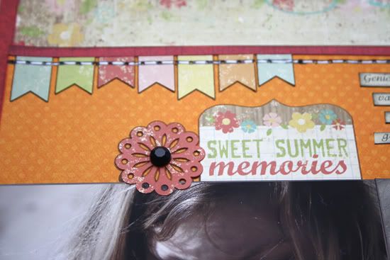
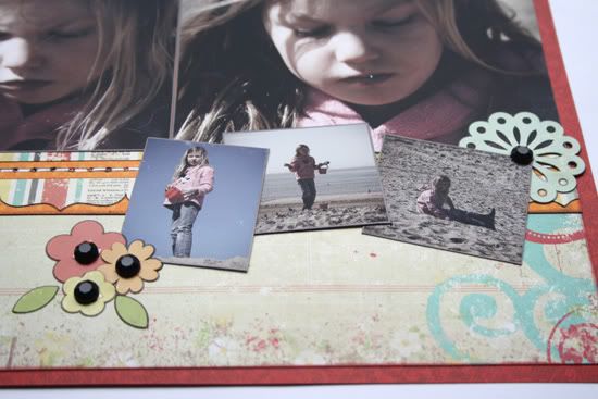
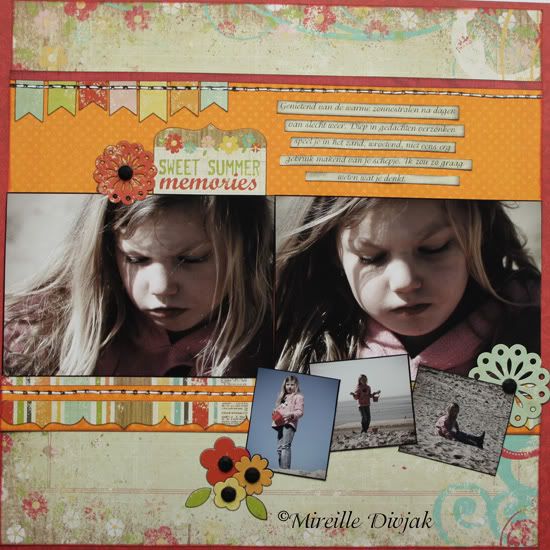
"Sweet Summer Memories" by Mireille Divjak
Supply list - Cardstock: Bo Bunny (double dot orange, citrus dot, and wild berry flourish); Patterned paper: Simple stories (100 days of summer - Sweet Memories, Endless Summer); Stickers: Simple Stories (Fundamentals Card Stock Stickers, 100 Days of Summer); Gems: Teresa Collins (Blingage); pens: American Crafts and Sakura

We had a large bunch of rainy days and then all of a sudden it was ok again. Not warm but "ok enough" to play. Watched her while she was diggin in the sand, in deep deep thoughts. Wished I knew what she was thinking.

Here's a closer look at the details:


  • • • • • • • • • • • • • • • • • • • • • • • • • • • • • •


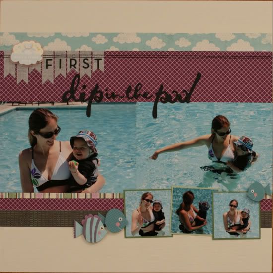
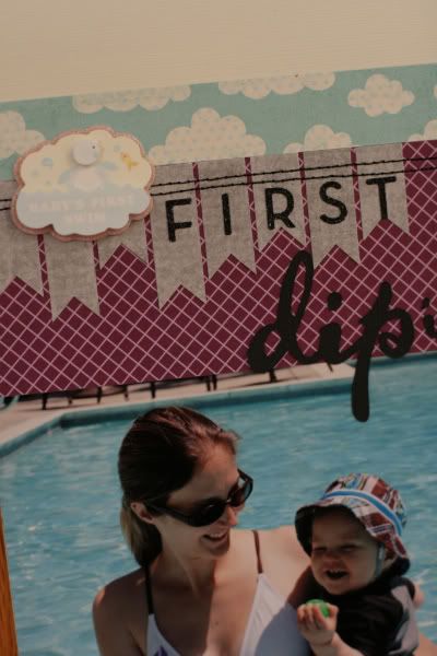
"First Dip in the Pool" by Noey Hunt
Products used - Patterned paper: Bella Blvd (purple), My Mind's Eye (clouds), Making Memories (stripes); Stickers: Marcella K (first swim), K&Company (fish), Making Memories (glitter letters); Tools: Sewing machine, Cricut Gypsy Font cartridge (title)

Variation 1: Framing. Since all of my photos were primarily blue on the edges, I needed to frame the supporting photos for them to stand out. I added a 2 1/4 inch square frame to each photo in two different shades of green.


Variation 2: Title. I skipped the journaling and stretched the title to fill some of the space that was intended for journaling. I figured the title really summed it up.

  • • • • • • • • • • • • • • • • • • • • • • • • • • • • • •


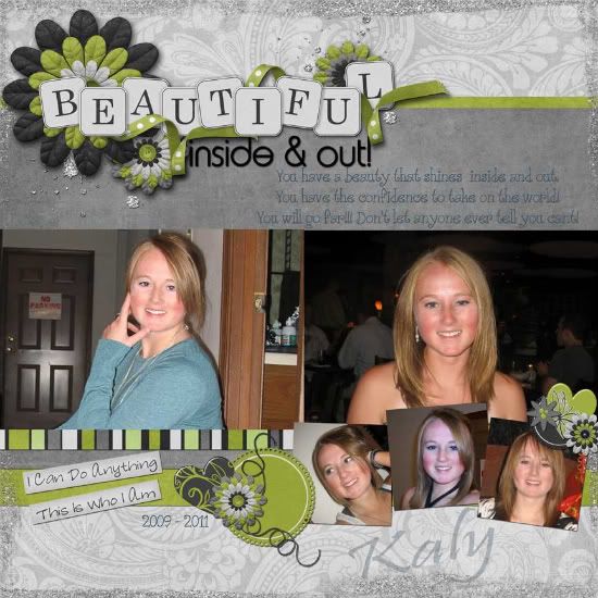
"Beautiful Inside & Out" by Tammy Volland

  • • • • • • • • • • • • • • • • • • • • • • • • • • • • • •


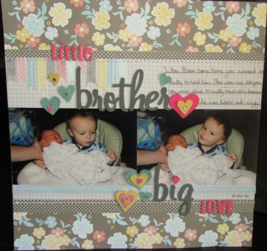
"Little Brother, Big Love" by Amy Roller
Supplies: Patterned paper: American Crafts; Letters: American Crafts, Fancy Pants; Felt: Papertrey Ink; Ribbon: American Crafts, unknown

One of the biggest variations I made to this page was deciding to use a pattern paper for the base. Because I only had two pictures to use, I also left off the three small photos and extended my title to that area. 


It helps draw your eye down and across page just as the photos would have. I followed the rest of the sketch pretty close, but used a ribbon across the bottom in place of the stripe because I didn't have a stripe that matched.

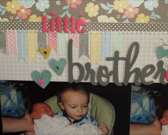
I added a few more ribbon strips in the top left corner to balance out my long title on top. 


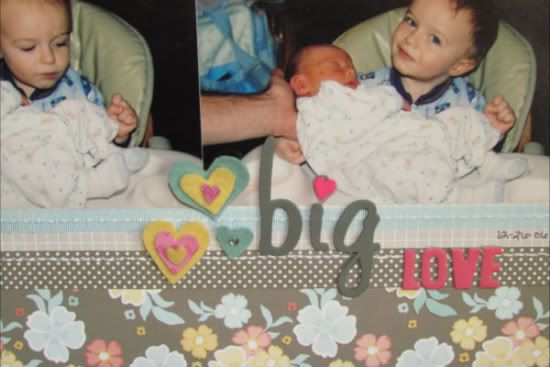
I just cut varying strips of coordinating ribbon and then cut an upside down "v" on the ends to form the pennant shape. I also hand cut several hearts in different sizes and colors of felt to sprinkle throughout. I topped them off with rhinestones or mini hand cut hearts from patterned paper. 

  • • • • • • • • • • • • • • • • • • • • • • • • • • • • • •


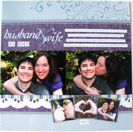
"Husband & Wife" by Melissa Bell
Supply List  - Transparency: Making Memories; Die Cut Paper: Making Memories; Rub-on: My Mind's Eye; Letter Stickers: Making Memories; Floss: DMC; Other: Patterned Paper and Cardstock

In many ways I stuck with the overall feel of this sketch and made a few variations to fit with what I wanted.

I omitted the heart embellishments. I wanted to keep my layout simple and felt that the hearts (or any other embellishment) would be distracting.


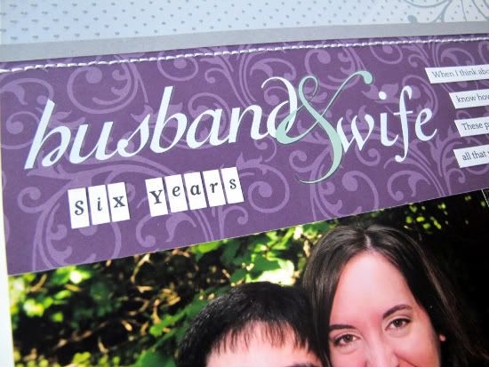
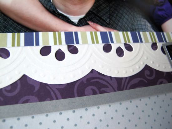
I also didn't use the flags for my title. I did keep with the differet strips of paper but used different sizes and added a portion of a die cut paper to add the lacy like scallop.


One thing I love about this layout is that I used oldies but goodies that I already had in my scrapbooking stash. Allison's sketches are a great way to use what you already have on hand!
•••••••••••••••••••••

Monday, August 8, 2011

Two-Page Week, Part 1

••••••••••••••••••••••••••••
Two-page Sketch #18


You can download and print this sketch by clicking on the two-page sketches link found under the "printable sketches" tab on the right sidebar.


"Whale Watching" by Lynette Jacobs
Supply list - Cardstock: Bazzill; Printed paper: Websters Pages, Yacht Club; Trims:Websters, Yacht Club; (sun) doily: Websters; Sun Rays: Bazzill die cuts; Felties: Sassafras Lass; Letters: Websters Yacht club; Droplets: Kaiser Scrapbook; Other: DMC cotton

• I followed the sketch closely. I replaced the vertical strips along the three photos on the right side with the red and white Websters trim.

• I made a sun be using the Websters doily and some Bazzill die cuts as the sunrays.


• I used a Prima swirl to get the outlines for the swirl and then did some hand sewing, adding the droplets.


• I cut the whale from some of the Websters printed paper.

• I have had the little fish and whale felties in my stash for ages and this was the right time to use them.


  • • • • • • • • • • • • • • • • • • • • • • • • • • • • • •


"We're in Jamaica Man!" by Tammy Volland

  • • • • • • • • • • • • • • • • • • • • • • • • • • • • • •


"Sunshine and Summertime" by Christina Hoffman
Supplies - Cardstock: Bazzill; Patterned paper: Fancy Pants Designs; Alphabets: Doodlebug Designs
(Sunshine) and Thickers (& and Summertime); Fish: Fancy Pants Designs; Craft wire: Unknown; Jewels: Kaisercraft; Floss: DMC; Glitter: Stickles

Variation #1: Instead of using three 6 x 4 photos I used a one 2 x 4, two 4 x 6 photos, and three 2 x 2 photos.

Variation #2: Instead of using large waves I created a pole with a spot that shoots water out since that is what the boys loved most about the Aquatic Center.
••••••••••••••••••••••
Tuesday, August 2, 2011

Card Week, Part 2

•••••••••••••••

Card Sketch #10

You can download and print this sketch by clicking on the card sketches link found under the "printable sketches" tab on the right sidebar.


"Wishing You Every Happiness" card by Lynette Jacobs
Supply list - Cardstock: Bazzill; Printed Paper: Pink Paislee, Butterfly Garden; Bling: Kaiser Craft; Sentiment: Kaiser Craft; Ribbon: unknown

On this card I stuck to the sketch. I used a square piece of printed paper for the background. I did faux stitching around my circles and the image in the center was cut from the Pink Paislee Butterfly Garden paper. I added the ribbon and bling in the scallops.

 • • • • • • • • • • • • • • • • • • • • • • • • • • • • • •
 

"Just Be Happy" card by Tammy Volland

 • • • • • • • • • • • • • • • • • • • • • • • • • • • • • •

"I Love You Bunches" card by Allison Davis
Supplies - Cardstock: Bazzill; Patterned paper: October Afternoon; Die cut pieces (butterfly, flower, circle in the center of the flower, and the sentiment): Jillibean Soup; Jewels: Kaisercraft

I stayed pretty close to the sketch for this card. The biggest change was substituting the large flower for the cupcake. I also added a line of stitching around the largest circle instead of on it.

To give the scallop circle a flowery look I slightly curled the ends of the scallops up and adhere it to the card with foam adhesive. I also added some jewels to each scallop.

Be sure to check out creative team member, Amy Roller's blog today. She's got a giveaway for our new Sketches for Scrapbooking: One-page Sketches book!
 ••••••••••••••••••••••
Tuesday, July 26, 2011

One-page Week, Part 2

•••••••••••••••••••
One-page Sketch #11


You can download and print this sketch by clicking on the one-page sketches link found under the "printable sketches" tab on the right sidebar.


"Adventuring" by Noey Hunt
Products used - Patterned paper: DCWV (diamonds), Stampin Up (green dotted); Embellishments: Making Memories (felt), Prima; Brads: Bo Bunny, American Crafts; Title: American Crafts Thickers; Tools: Cricut Reminisce cartridge (swirl)

Variation 1: I wanted a little bit less white space on my layout and room for slightly larger photos so I stretched the background patterned papers an extra inch taller.

Variation 2: I cut my photos a little bit larger each and changed one from square to rectangle to better fit my theme. I also added an extra photo to fill in the gap left by using a shorter title than the sketch called for. And it was the perfect use for the photo I had left. The photo with the bird is low quality (blurry) but when used in such a small size, it looks good enough and you still get the same added element of the story.


Variation 3: I switched the stars for flowers to go with my outdoor layout. I used a variety of flower colors to match both the patterned paper and the actual grassy greens from the photos.

 • • • • • • • • • • • • • • • • • • • • • • • • • • • • • •


"Sweet Shadow" by Tammy Volland
Supplies - Digital Kit by: Connie Prince / Brothers; Software used: Adobe Photoshop CS3

I had to make of sketch of my Grand-dog! This is Shadow, sometimes sweet sometimes not! This sketch was perfect for the head shots I had of him. I didn't vary to much from the actually sketch but did make a few minor changes. I added drop shadows to all pieces. I also used some Photoshop actions with this one. I used the distressed edges and inking. Love those actions! You can find them at
www.atomiccupcake.com.

Variation 1 - I tilted the image just a little to give it a off balance look.

Variation 2 - Instead of the swirl I used ribbon and string.

Variation 3 - I did the journaling under the image to make more room for the ribbon. I also omitted the top part of the journaling.

Variation 4 - I added some flowers here and there to break up the stars. The papers I chose was over powering with all stars.

Variation 5 - With the title I did the all caps but I staggered them to give it some dimension. Letters were part of the kit I used.

Variation 6 - I added a border paper around to give it more color and depth.

 • • • • • • • • • • • • • • • • • • • • • • • • • • • • • •


"Time to Ride" by Carolyn Wolff
Supply List - Patterned Paper: American Crafts; Cardstock: Bazzill; Alpha Stickers: Doodlebug, Kaisercraft; Embellishments: Basic Grey, My Mind’s Eye, Jillibean; Ink: Ranger Distress Ink, Vintage Photo; Bakers Twine: My Mind’s Eye; Journal Die-cut (cut into strips): Jenni Bowlin; Glimmer Mist: Tattered Angels

Variation #1 – I loved the three rectangles on the background of the sketch. I mounted them on two different colours of cardstock to add a few more layers.

Variation #2 – I overlapped some of my photos but kept with the concept shown on the sketch.


Variation #3 – I replaced the stars and swirls with the tree stickers. I popped them up with foam adhesive to create dimension.


Variation #4 - I add a strip of patterned paper along the bottom of three rectangles to add a burst of colour.

Here's a closer look at some details:


 • • • • • • • • • • • • • • • • • • • • • • • • • • • • • •


"Just Dance" by Christine Chain
Supplies - patterned paper, letter stickers: American Crafts (Peachy Keen); buttons: my stash

1) The first, obvious variation, is that I used one 4x6 photo instead of the three smaller ones. I didn't change the size of the three 3x6 panels behind the photos.

2) I substituted these three accordion flowers in the lower right for the stars.


I made these flowers (and the other one) using the bar code strip on the bottom edge of each of my sheets of paper. I love how American Crafts (and other brands too) are making this strip usable. I scored each 1/2" strip every 1/4". After accordion folding each, I taped the ends together with the red "sticky tape" and then glued it down to a 1" punched circle. I found a great tutorial here

3) Instead of the pretty stitched flourishes and multiple stars, I put only one more flower in the upper right corner of the photo. I tried to just keep the layout looking balanced.


4) To aid with the overall balance, I spelled out "just" in a skinnier, yellow letter sticker, and "dance" in a fat bold color letter sticker. 


Both came out of the same set of letter stickers and match this line of papers perfectly!

5) I added my journaling onto 3/8" strips to make it a bit more legible, and to make something stand out in the lower right.


•••••••••••••••••••••••••••••••••••